Synapse
Unifying fragmented healthcare workflows into one connected patient experience.
Hospitals often rely on multiple disconnected systems to manage patient records, appointments, prescriptions, and administrative workflows. Synapse centralizes these experiences into a single platform, enabling healthcare professionals to access critical information faster, reduce administrative effort, and deliver better patient care.
Responsibilities
Scope of work across strategy, structure, and interface design
- UX Research
- User Flows
- Information Architecture
- Wireframing
- UI Design
- Design System
- Interactive Prototype
Primary Users
User groups the platform was designed to support
- Doctors
- Nurses
- Administrators
- Hospital Management
Impact Stats
Centralize every patient interaction into one trusted source of information.
Help clinicians access the information they need without unnecessary navigation.
Eliminate duplicate tasks through connected workflows and shared patient data.
Enable teams to collaborate with greater visibility across the entire patient journey.
Healthcare professionals spend too much time switching between disconnected systems instead of focusing on patient care. Synapse was designed to eliminate these inefficiencies through a unified, patient-centered experience.
The Problem
Fragmented systems slowed consultations and increased administrative work
Fragmented systems slowed consultations, increased administrative work, and made it difficult to maintain a complete view of each patient's history.
- Medical records scattered across multiple systems
- Repeated manual data entry
- Limited collaboration between departments
- Time-consuming patient searches
- Increased risk of missing critical information
The Solution
A centralized platform connecting each stage of the patient journey
Synapse introduces a centralized healthcare platform that connects every stage of the patient journey into a single experience.
- Unified patient records
- Centralized appointments
- Digital prescriptions
- Connected clinical workflows
- Better visibility across departments
Design Constraints
Balancing usability with operational complexity in healthcare
Designing for healthcare required balancing usability with operational complexity across fast-moving clinical and administrative workflows.
- Constraint 01
High Data Volume
Large amounts of patient information had to remain easy to scan and retrieve.
- Constraint 02
Role Diversity
Multiple user roles required tailored priorities within one shared system.
- Constraint 03
Clinical Pressure
High-pressure environments demanded low-friction flows and clear hierarchy.
- Constraint 04
Operational Complexity
Administrative workflows needed to connect without introducing extra steps.
- Constraint 05
Decision Speed
Critical actions had to be reachable quickly to support timely care decisions.
- Constraint 06
Future Scalability
The architecture needed to support future modules without redesigning core flows.
Success Metrics
Expected outcomes used to evaluate product direction
These KPIs represent expected impact targets rather than measured analytics.
Patient Journey
How Synapse improves each stage of the care lifecycle
- Stage 01
Patient Registration
Unified intake reduces duplicate entries across systems.
- Stage 02
Appointment
Connected scheduling improves visibility for all departments.
- Stage 03
Consultation
Clinicians access complete context in one place before decisions.
- Stage 04
Diagnosis
Relevant history and current findings stay linked to reduce risk.
- Stage 05
Prescription
Digital prescribing keeps treatment records accurate and traceable.
- Stage 06
Lab Results
Diagnostics appear in the same flow, avoiding extra system switching.
- Stage 07
Follow-up
Longitudinal records make continuity of care easier to manage.
Before Synapse
Disconnected tools created operational friction
- Multiple disconnected systems
- Duplicate records
- Repeated data entry
- Slow patient lookup
- Poor collaboration
After Synapse
Connected workflows improve speed and coordination
- Unified patient record
- Connected workflows
- Faster information access
- Reduced administrative effort
- Better collaboration
Design Process
From research insights to scalable product decisions
A structured process focused on solving operational pain points while improving usability in real healthcare contexts.
- Step 01
Research
Understand user needs, existing healthcare workflows, and operational challenges.
- Step 02
Problem Definition
Identify pain points, prioritize opportunities, and define product goals.
- Step 03
Information Architecture
Organize healthcare modules into a scalable navigation structure.
- Step 04
Interface Design
Design intuitive workflows supported by reusable components and consistent interactions.
- Step 05
Prototype & Iterate
Validate concepts, refine interactions, and improve usability through continuous iteration.
User Personas & Needs
Understanding the primary users, their motivations, challenges, and how the product supports their goals.

Doctor
Primary decision-maker responsible for diagnosing patients and coordinating treatment.
Goals
- Access complete patient history instantly
- Reduce consultation time
- Make informed clinical decisions
Pain Points
- Fragmented patient records
- Time spent searching multiple systems
- Missing clinical context
Needs
- Unified patient profile
- Fast search and navigation
- AI-assisted patient summaries
Primary Tasks

Nurse
Coordinates patient care, treatments, and daily clinical activities.
Goals
- Monitor patient status efficiently
- Update treatments quickly
- Coordinate with doctors
Pain Points
- Manual documentation
- Delayed updates
- Switching systems
Needs
- Shared clinical records
- Real-time updates
- Simplified workflows
Primary Tasks

Administrator
Manages hospital operations, appointments, and administrative processes.
Goals
- Reduce administrative workload
- Manage appointments
- Maintain accurate records
Pain Points
- Duplicate data entry
- Scheduling conflicts
- Fragmented systems
Needs
- Centralized administration
- Automated scheduling
- Connected workflows
Primary Tasks
Hospital Management
Oversees hospital performance, resources, and operational efficiency.
Goals
- Improve hospital efficiency
- Monitor KPIs
- Optimize resources
Pain Points
- Limited visibility
- Disconnected reporting
- Slow decision making
Needs
- Executive dashboards
- Centralized reporting
- Analytics
Primary Tasks
Design Principles
Principles Guiding Product Design
- Prioritize critical information before secondary details.
- Reduce cognitive load through clear visual hierarchy.
- Maintain consistency across every workflow.
- Design scalable components that support future growth.
- Create interfaces that remain intuitive in high-pressure environments.
Information Architecture
Workflow-centered structure for lower navigation friction
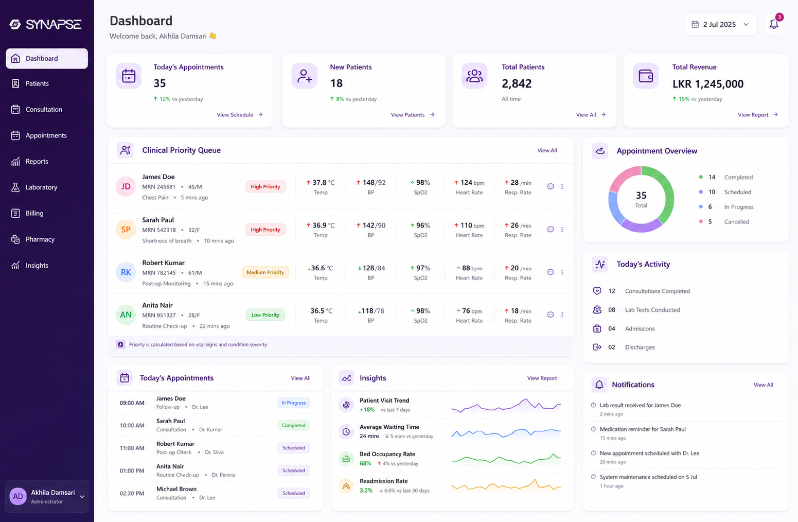
The platform structure was organized around real healthcare workflows, allowing users to move naturally between patient records, appointments, prescriptions, clinical notes, imaging, billing, and administration without unnecessary navigation.
- Dashboard
- Patient Directory
- Patient Profile
- Consultations
- Appointments
- Laboratory Results
- Imaging
- Medications
- Billing
- Notifications
- Settings
Key Features
Core capabilities designed to improve speed, clarity, and coordination
Each feature supports faster workflows while keeping the full patient context connected.
Connected Patient Records
A unified patient profile containing medical history, prescriptions, appointments, laboratory results, imaging, and consultation notes.
Smart Dashboard
Surface critical information first, allowing clinicians to immediately understand patient status.
Appointment Management
Manage consultations through an integrated scheduling system with improved visibility.
Electronic Prescriptions
Digitally manage prescriptions while maintaining complete patient history.
Clinical Collaboration
Enable doctors, nurses, and administrators to work from the same connected platform.
Design Decisions
Decisions made to improve usability, scalability, and care continuity
Every decision aimed to reduce friction while helping teams work with confidence in high-pressure settings.
Responsive Layout
The interface adapts seamlessly across desktops, tablets, and clinical workstations while maintaining consistency and usability.
Information Hierarchy
Critical patient information is prioritized before secondary content to reduce search time during consultations.
Progressive Disclosure
Complex medical information is revealed only when needed to reduce cognitive overload.
Modular Components
Reusable interface components improve scalability and maintain consistency across future healthcare modules.
Navigation
Persistent navigation minimizes context switching between workflows.
Accessibility
Typography, spacing, and contrast improve readability during extended periods of use.
UI Highlights
Annotated screens showing why key interface regions were designed to reduce friction and improve decision quality.
Screen Rationale
Product decisions behind major screens
- Screen 01
Dashboard
The dashboard prioritizes patient alerts before administrative tasks because clinicians begin each shift by reviewing urgent cases.
- Screen 02
Patient Profile
The profile consolidates every clinical interaction into one timeline to reduce context switching during consultations.
- Screen 03
Appointment Calendar
The calendar simplifies scheduling while improving visibility across departments that depend on shared resources.
- Screen 04
Consultation Workspace
The workspace keeps notes, history, and actions connected so clinicians can complete visits with fewer context breaks.
- Screen 05
Availability View
Role-based availability was designed to reduce coordination overhead and support faster appointment decisions.
Design System Overview
Reusable components that improve consistency and scalability
A shared component system was used to maintain interaction consistency while supporting product growth across healthcare modules.
- 01
Buttons
Primary, secondary, and destructive actions with consistent states.
- 02
Cards
Structured information blocks for patient summaries and modules.
- 03
Forms
Input patterns for registration, scheduling, and clinical updates.
- 04
Tables
Dense views for records, appointments, and administrative datasets.
- 05
Charts
Operational trend visualization for performance and planning.
- 06
Status Chips
Fast visual states for priority, progress, and care status.
- 07
Navigation
Persistent module access that preserves context across workflows.
- 08
Badges
Lightweight indicators for counts, warnings, and metadata.
Accessibility Considerations
Designed for readability and usability under pressure
The interface was designed with accessibility and usability in mind.
- WCAG AA color contrast
- Readable typography
- Consistent spacing
- Keyboard-friendly navigation
- Clear visual hierarchy
- Large interactive touch targets
Design Trade-offs
Rationale behind key interaction choices
- Why left navigation? Healthcare professionals switch modules frequently, so persistent navigation reduces cognitive load.
- Why cards instead of tables? Cards improve scanability for patient summaries while keeping information digestible.
- Why progressive disclosure? Showing all medical information at once increases cognitive load, so detail is revealed only when relevant.
Future Opportunities
Roadmap directions for continued product evolution
These opportunities represent future product evolution beyond the current concept scope.
- Roadmap 01
AI Consultation Summaries
Auto-generated visit summaries to reduce documentation burden.
- Roadmap 02
Voice Clinical Notes
Voice-assisted capture for faster note-taking during consultations.
- Roadmap 03
Telemedicine Integration
Remote consultation workflows integrated with core patient records.
- Roadmap 04
Wearable Sync
Continuous data ingestion from devices for longitudinal monitoring.
- Roadmap 05
Medication Reminders
Patient-facing reminders to improve adherence and care continuity.
- Roadmap 06
Predictive Analytics
Early risk signals to support proactive planning and intervention.
Expected Impact
Operational and clinical improvements enabled by a connected platform
- Reduce time spent locating patient information.
- Minimize repetitive administrative tasks.
- Improve collaboration between healthcare departments.
- Support faster clinical decision-making.
- Create a scalable digital foundation for future healthcare services.
Key Takeaways
Lessons that strengthened my product design approach
Designing Synapse reinforced several important lessons.
- Complex products become easier to use through thoughtful information architecture.
- Workflow efficiency is often more valuable than adding additional features.
- Good healthcare experiences reduce cognitive load during high-pressure situations.
- Designing scalable systems requires balancing user needs, business goals, and technical constraints.
If I Had More Time
Next steps to evolve Synapse beyond concept scope
With additional time, I would continue evolving Synapse through:
- Usability testing with healthcare professionals
- Expanded design system documentation
- Mobile clinical workflows
- Offline support
- Accessibility validation
- Integration with existing hospital EMR systems
- AI-assisted patient summaries
Synapse demonstrates how thoughtful product design can simplify complex healthcare workflows while creating a scalable foundation for the future of digital healthcare.